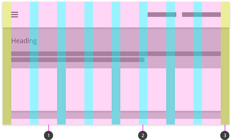
TPR uses a fixed grid system. Use grids to lay out the content on pages. A grid consists of columns (1), gutters (2), and margins (3).
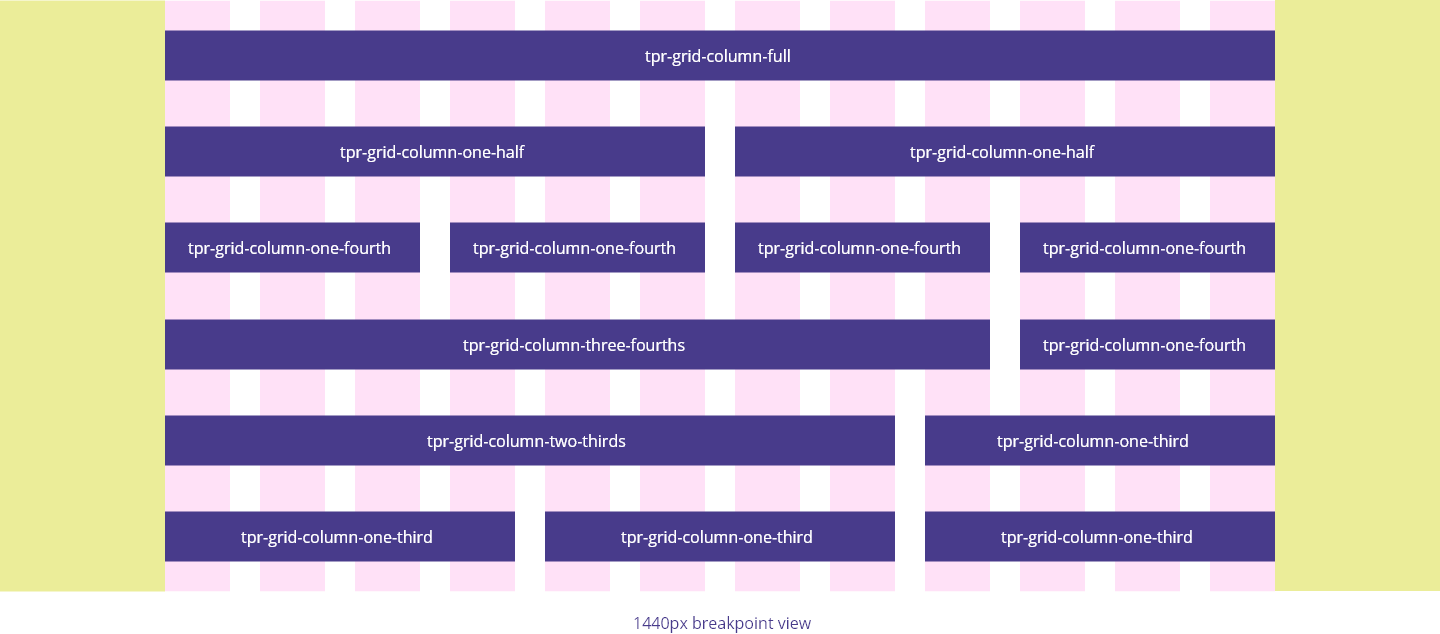
The desktop grid system is between 992px and 1440px wide and consists of:
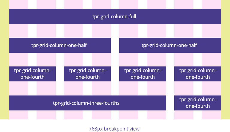
The tablet grid system is between 768px and 991px wide and consists of:
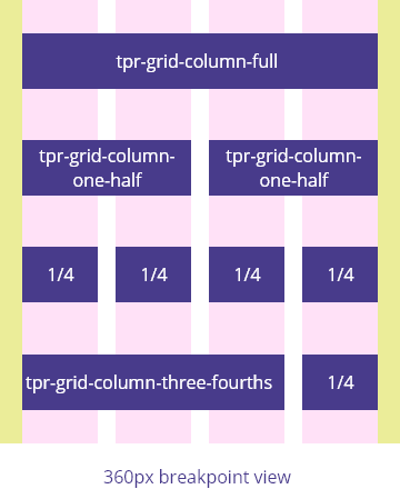
The mobile grid system is up to 767px wide and consists of: